Ticketwala - Identity Design
This identity design project was a learning experience for me. The client was an online booking platform for event tickets, in Pakistan. The identity and brand was significant for them as they were catering to a wide range of users. The only specifications provided were the name and that the logo should be modern, playful, and grounded in the local context.
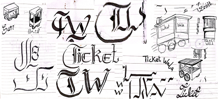
For this project I closely collaborated with the client and developed various iterations of the logo, playing with language, typography and even using my calligraphic skills.
Target Demographic
Living in Pakistan
Based in Pakistan's urban centers.
Economic Class A & B
Have significant purchasing power and value quality, convenience, and experiences.
Broad Age Group
Spanning various age brackets, from young professionals to established adults.


Logo Ideation
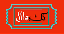
The initial logo design incorporated bold colors and a traditional ticket motif, drawing inspiration from the moodboard. However, client concerns arose over its potential loudness, especially when placed on promotional materials. A variant of the logo in Urdu faced similar feedback, with the calligraphy lacking modern appeal. Worries about maintaining a consistent brand image with separate logos for each language were also noted.
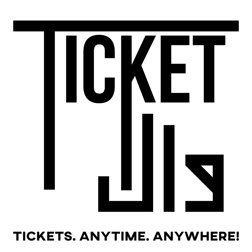
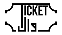
Responding to the feedback, we experimented with Urdu scripts and settled on a modified kufi script, creating a "minglish" logo. "Ticket" remained in English for emphasis, while "wala" stayed in Urdu for local flavor. The elongated English characters aimed to blend the two languages. To address concerns about loudness, the logo color was changed to black.
The final design removed the ticket motif, aligned the Urdu text for balance, and added a tagline for clarity. The iterative process resulted in a culturally relevant logo, effectively representing the platform amidst language-specific considerations.
Grid & Typography
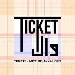
To ensure visual impact, we set the clear space around the logo to approximately half the logo size on three sides and one-third on top. This prevents clutter and maintains balance.
The logo marque is strategically placed in the optical centre, creating visual harmony and drawing attention. This centre is the focal point that naturally captures viewer's focus, enhancing the logo's aesthetic and identity.
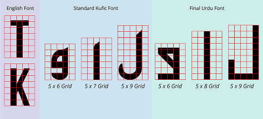
View on MiroWe developed the the Urdu type based of the Kufic script as the block letters merged best with the English type. We opted to not use a preexisting font of the Kufic script as it was hard to blend with English type. Instead we took the stroke width of the English font to define a grid and developed easily recognisable Urdu characters with in that grid. This allowed for consistency between the English and the Urdu Typefaces.
Logo Usage
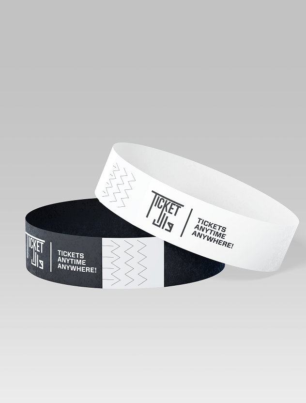
Two variants were provided to the brand for use on collateral they develop. A white version for dark backgrounds and black logo for lighter backgrounds to assure there is enough contrast. Longer variants of the logo were also produced for specific collaterals such as wrist bands, standees and web banners.